When it comes to exhibiting, one of the leading concerns for exhibitors is how to stand out on the trade show floor and attract more attention. There are a variety of ways your brand can accomplish this, including improving your booth design. Booth design is often just the beginning of engaging trade show attendees, but an important first step. Let’s examine the following tips we’ve gained over nearly 2 decades in the business:
Incorporate Something Unique Into Your Booth Design
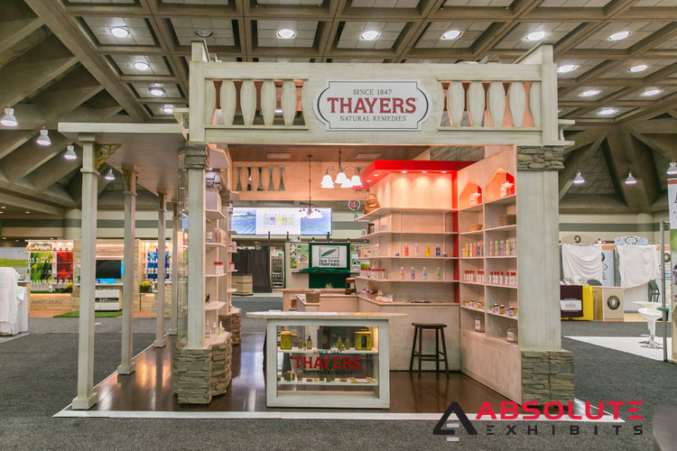
Nobody but teenagers want to fit in with the pack and look exactly the same. That being said, your brand is well beyond its teenage years of wanting to be invisible. Instead, you want to stand out and be noticed. Using clever booth design, you can stand out as a leader in the industry, as a brand with heart, or many other ways. Depending on your desired messaging or positioning, you can use your booth design to communicate this immediately across the exhibit hall.
You could consider unique themed structures, interesting props, cutting edge technology, or more. The sky’s the limit with your booth design. If you can imagine it and you have the budget, you can build something that encourages people to make a beeline to your virtual front door.

Use Bold Colors and Graphics in Your Booth Design
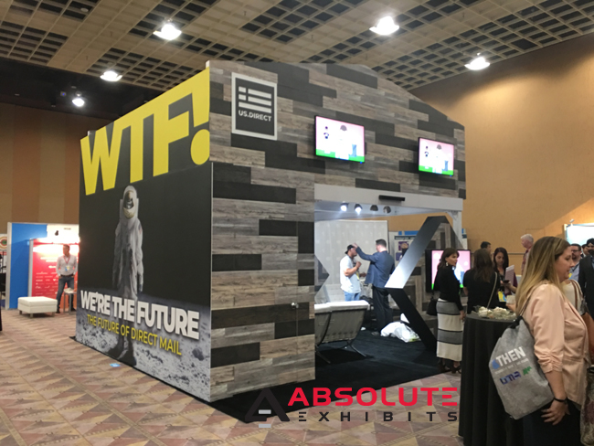
Ever wonder why certain brands use certain colors? Take McDonald’s, Wendy’s, or many other fast food chains color schemes. They use red and yellow. Why? Because people notice these bright colors. While color theory may suggest you’d want to choose another color to correspond better with your brand identity, the point is to stand out using bold colors and graphics.
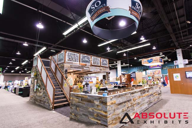
Recently, we had a beautiful trade show booth which featured rustic wood. However, on the side of their double-deck exhibit, they featured a bold graphic which piqued attendees’ curiosity. What was this company about with a bold graphic like that? Among many other gorgeous elements of their booth design, this inspired trade show attendees to come on in and take a look.

Introduce Motion into Your Booth Design
The basic elements people respond to the most are color, light, and motion. Something moving will capture people’s attention 10/10 times. If you see a giant windmill spinning across the trade show floor, you’d tend to notice it. You would also subconsciously decide you were going to check it out.
Recently, one client featured a spinning globe in their booth design. It communicated their world-wide presence quite nicely and tied the idea of low-cost mobile carrier services to the idea you could call abroad for less. Because of this spinning globe, many people beat a path to their virtual front door and they successfully spread their message.

Build Up, Not Out
You don’t have to have a trade show booth that’s 100×100. This sized booth is often out of budget range for many brands and can be impractical when you add the cost of renting your trade show booth on top of it. Instead, consider maximizing your space by building a double-deck display that allows you the freedom to showcase your products and add private meeting space. Double-deck displays often stand out from their sheer size alone, attracting more attention on the trade show floor.

When it comes to designing your trade show booth, it’s important to keep your goals in mind. By collaborating with your exhibit design house partner, you can align these goals with your brand identity to do something that is different and attracts more visitors.


