We work with numerous industries in trade shows across the globe. One thing they all have in common is crowded exhibit halls with brands trying desperately to stand out from one another. One of the best ways to do that is to design a trade show exhibit that stands out. But what kinds of things make your exhibit stand out from a sea of similar exhibits? The answer could lay in your signage. It’s important to choose the right exhibit signage for your booth so you can set yourself apart from the crowd. Here’s a summary of a variety of options that you can consider in your next exhibit design:
3D Exhibit Signage
3D exhibit signage is a growing trend among brands across multiple industries. The reason this is so popular is because it’s different. It offers depth and dimension that often isn’t present in the graphics on their trade show exhibit. 3D exhibit signage can be subtle, or it can be large and in your face. The fact remains 3D exhibit signage works to grab people’s attention.

Backlit Exhibit Signage
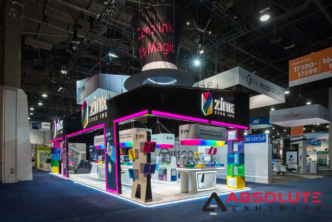
Whether you’ve opted for 3D signage or not, backlit exhibit signage brings a whole new element to your trade show exhibit. The lighting makes people take notice of your logo and messaging. There’s no question, even in a dimly lit exhibit hall, whose booth you’re looking at. It also gives off a fun impression. Of the 3 core elements of trade show exhibit design, light is one of the most important elements. Using light throughout your trade show exhibit, including in your exhibit signage is a great way to draw more attention to your booth and increase foot traffic.

Hanging Overhead Signs
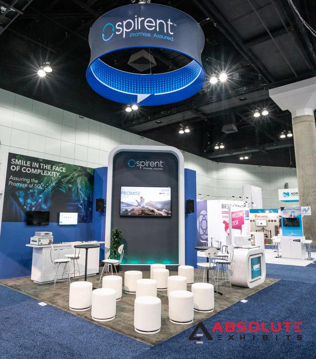
It seems like everyone on the trade show floor uses hanging overhead fabric signs. This has become rather standard to draw eyes from across an exhibit hall. However, you could add something different to spice this common exhibit signage up and get people talking. One of our clients used a hanging LED sign to feature their video playing high above their booth. Another client used a hanging symbol of their brand which spun between their hanging fabric sign. And yet another client opted for inside lighting and color. Your options to make your overhead exhibit signage different are as limitless as your imagination and budget will allow.

Make Your Exhibit Signage Big, Bold, and Bright
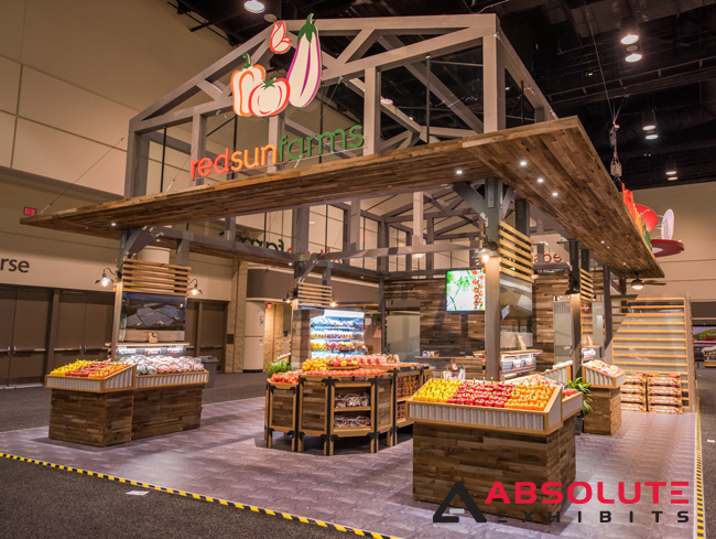
Let’s face it, nobody is going to notice neutrals and beiges in a sea of often colorful exhibits. This is why it’s so important to make your exhibit signage big, bold, and most importantly, bright. Adding pops of color to otherwise neutral color palettes is a great way to gain exposure. This can break up much of the monotony of a wooden exhibit or an all-white exhibit. Think of how your use of color can enhance your exhibit with this simple change.

Whether you’re in an industry like machinery, food, or retail, your exhibit signage is an important piece of your exhibit design. Your signage is your calling card and its what can help leave a lasting impression of your brand with your customers, prospects, and leads. For more great tips, ask your exhibit design house partner for help in designing something special.


