Often, when companies start exhibiting, they start with a 10×10 to dip their toes in the trade show waters. Then they either graduate to a 10×20 or a 20×20 trade show booth. The 20×20 trade show booth is really very common in the trade show business, no matter the industry. It’s large enough to make a statement, but not small enough that a larger company would look like they are small. Whether new to the exhibiting space or an old hand, it’s helpful to know the ways in which a brand can make their 20×20 trade show booth feel bigger. Consider the following ideas:
Build Your 20×20 Trade Show Booth Up, Not Out
When space is a premium, you don’t want to shove every little item into your trade show booth. There needs to be space for people to walk in, mill around, and to feel comfortable discussing your brand’s goods and services. If you crowd too much into the trade show booth, then it can actively drive people away. They’ll never approach your booth, let alone be able to appreciate your trade show display design. This is why building up is a great idea.

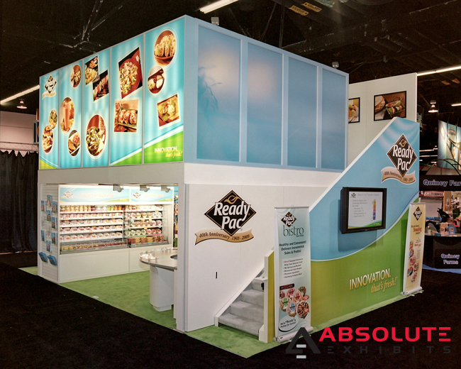
A 20×20 trade show booth is an excellent candidate for double deck trade show displays. This means that instead of building out, your brand can build up, offering another deck to house a semi-private meeting room to close deals. Or it can add another floor to impress prospects with visually stimulating video. The possibilities are only limited by your imagination.
Introduce Interesting Lighting Elements to Your 20×20 Trade Show Booth
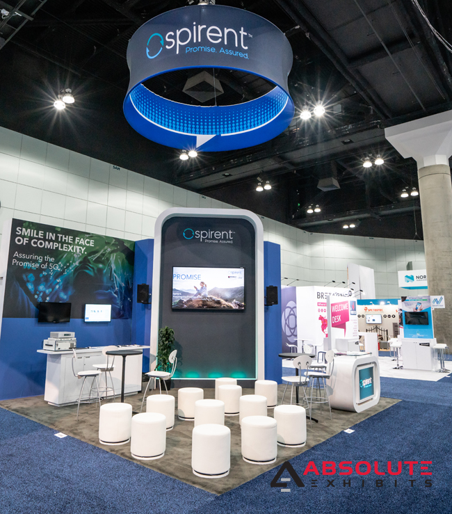
The basics of trade show booth design are color, light, and movement. But did you know that depending upon how you use lighting, you can make your 20×20 trade show booth feel bigger or even smaller? When designing your 20×20 trade show booth, think carefully about your lighting options. Some options draw the eye naturally and make the space feel bigger, brighter, and bolder. Some options make the space feel small and dark. Talk with your exhibit design house partner about your options so you know what will work in the space you’re considering. They’ll have great ideas that can make your booth feel bigger with lighting alone.

Think About Your Flow of Traffic
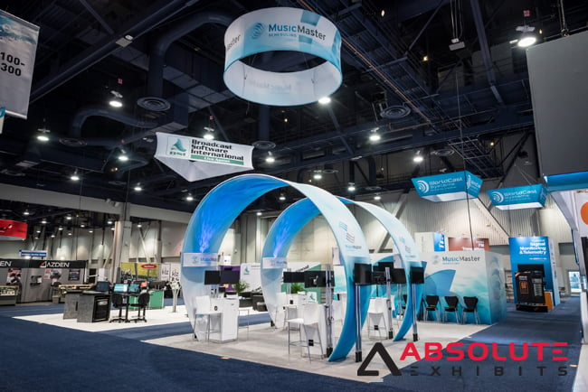
There are principles of design such as feng shui that focus on the flow of chi, or energy, throughout a space. Would you be surprised to find out the flow of movement, whether energy or a prospect’s ability to move throughout a trade show booth are equally important? To make a space feel bigger, it’s important there’s enough of what designers refer to as negative space. Negative space is areas which are not filled with stuff. It’s the blank space that allows people to move around and mill around without feeling cramped in a 20×20 trade show booth. Negative space isn’t unique to just trade show booth design, but are also important elements of interior design and architecture. When your trade show booth is built by architects, such as those Absolute Exhibits employs, you’re certain to reap the benefits of these basics of design.

Introduce Inviting Elements Such as Technology
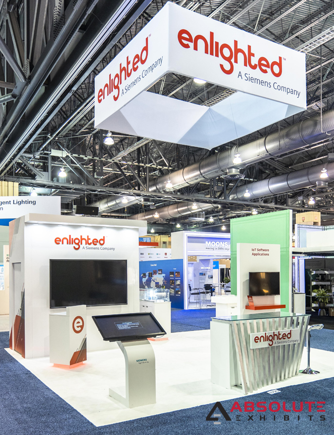
As technology continues to progress, there are elements that exhibitors continue to embrace. This includes touch screens, gamification, virtual reality simulators, augmented reality simulators, and more. Technology can be discreet- mounted on the wall or introduced in a single pop up stand. It can be as inobtrusive as you’d like and still make your 20×20 trade show booth feel bigger. Little discreet pops of surprise and excitement help to make your booth still feel open as well as inviting. They also don’t clutter the space, helping it to feel much bigger than it would with large heavy machinery.

When designing your 20×20 trade show booth, think carefully about how you can make it feel bigger. This can be by making it look bigger through the design, or opening up walls, walkways, and including exciting elements in unobtrusive areas. By making your trade show booth feel bigger, you can ensure you don’t fade into the background as a part of the scenery.


