We all know that trade shows are competitive- we all want to outshine our competition. This leads to new trade show exhibit design options, themes to outdo the competition, props to outshine one another, and more. However, whether your trade show booth is simple or complex, the best way to optimize your trade show booth is with the right trade show graphics. What does that mean? Do you have to engage a company to design options for you? The truth is that whatever your approach to developing the messaging, there are many ways to optimize your trade show graphics in your trade show booth including:
Concentrate Your Trade Show Graphics on Your Value Proposition in Your Trade Show Booth
Is it immediately clear upon gazing at your trade show graphics what your company does, why it’s different from your competitors, and why people should care? If your trade show graphics don’t communicate these items clearly in your trade show booth, you may need to reevaluate how you approach your design. Not every trade show attendee will be familiar with your business, even in a small industry. That means your trade show graphics need to pop inside your trade show booth. They need to clearly communicate your value proposition. As people walk by, they need to immediately understand what it is you do, how it’s different from your competitors, and why they should care or they likely won’t stop by your trade show booth. What’s worse than nobody knowing you exist at a trade show? People knowing you exist and not caring at all what the messaging is on your trade show display back wall. That’s a real sting to the desired ROI.

Create Trade Show Graphics to Support Your Overall Messaging
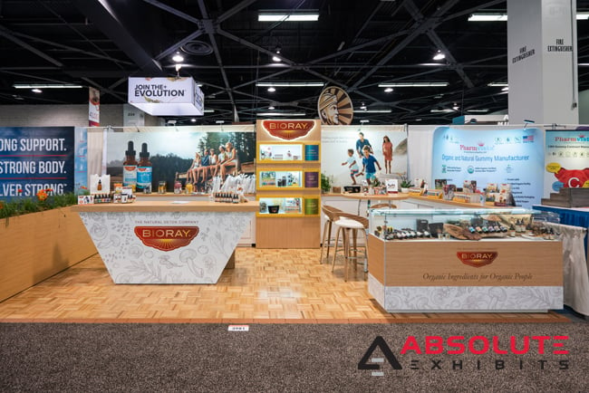
Your value proposition is very important in the trade show graphics but do you have adequate visuals to support the messaging in your trade show booth? This may seem like a given, but can be easily tank your trade show attendance. Take for example businesses in the natural products space. In those cases, their trade show graphics want to show not only a mixture of natural messaging, but visuals that bring that point home. Think of it similarly to a company focused on technology- you wouldn’t want to have a visual of something that is more focused on women walking a meadow to discuss their feelings. This kind of visual doesn’t immediately connect to your value proposition nor does it actually communicate anything about your goods and services. It’s an ambiguous visual that will confuse trade show attendees. When you’ve only got seconds to attract someone to your trade show booth, your trade show graphics need to be clear. Otherwise, you’re wandering too far in the woods and may find you’ve missed the mark altogether. Keep it relevant, keep it concise, and keep it interesting. If you’re in doubt and only have a sentence or two you rely upon as your elevator pitch, consult your Account Executive and designer for assistance in creating some compelling trade show graphics that will help you to communicate your desired messaging both visually and contextually.

Keep Line of Sight in Your Trade Show Booth in Mind When Creating Trade Show Messaging
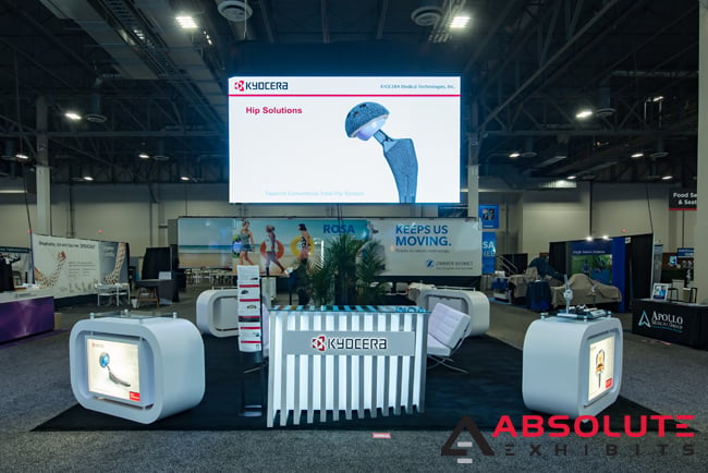
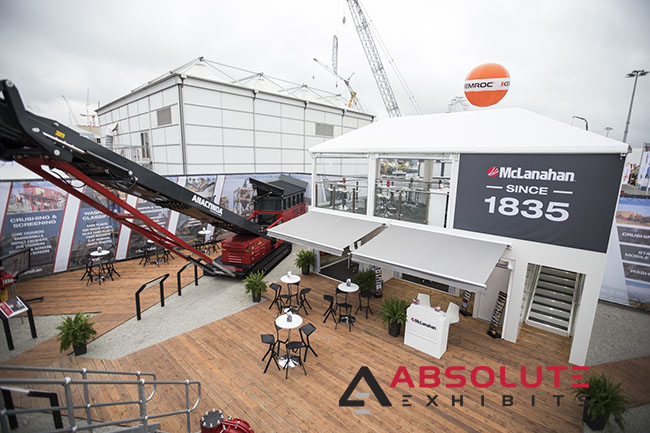
We’ve discussed line of sight previously, but has the message hit home yet? There are various points that are important to line of sight- such as the hanging sign, your trade show booth back wall, your reception counter. We all look at different areas when passing by a trade show booth space, but your trade show messaging is supposed to pop in specific areas. Consider where you have your most important messaging placed… do you have a tag line or additional text messaging inside your hanging sign? Are there lines of text accompanying your trade show graphics on the back wall? What does your reception counter say? Do you have other highly visible items that could communicate your value proposition to people walking by? Consider how line of sight is very important to the overall trade show display design. Then implement these strategies in those places.

Trade show graphics are a very important piece of your overall trade show booth design. Consider how blank your exhibit would look if you had no text messaging or visuals to communicate what your business is about, whether from near or afar? Also consider how others will see your exhibit and what impression they’ll walk away with. Sure, you know everything about your goods and services, but is it obvious to anyone outside of your business? It’s best to ask an outside observer such as a relative who isn’t quite sure what your business does or your Account Executive and design team. If they can’t figure out what it is you really do, you may be in trouble. However, that represents a great opportunity to edit your approach so strangers are better able to determine your value proposition at a glance. For more great ideas, ask your exhibit design house partner.


