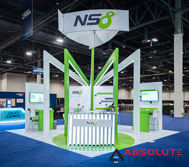
Trade shows can have anywhere from hundreds to well over a thousand companies exhibiting all at once. We know you are probably keeping an eye on your competition but stop and think for a second about trade show visitors. Within a potential nine hours on the trade show floor, their senses are bombarded with hundreds of messages and brands. It’s a cacophony of imagery, sounds, and people trying to entice them to walk into their trade show booth to buy something or to demo something.
Companies determined to stand out and be competitive need to understand what their customers want to see at a trade show. This means using the trade show booth to cater directly to their unstated needs and emotions in a fashion that will make you stand out from the exhibitors g next to you. First, you have to get them in your trade show booth. To accomplish that goal, a good tactic is to give purpose to every design aspect of your trade show display.
On the trade show floor, a trade show booth is not just a booth: it’s an experience. Visitors make split second decisions whether to engage with this experience or pass. This requires a trade show booth design that has the visitor in mind from the second they make eye contact with your brand and messaging. With only seconds to capture this attention, exhibitors need to be mindful of their trade show booth design and how they show up on the trade show floor. In those few seconds, it’s as easy to lose someone’s interest and fade into the background as it is to stand out and demand attention.
So how does the Rule of Thirds play a part in directing traffic to your trade show booth?
Definition of the Rule of Thirds as a Design Principle
The Rule of Thirds is a set of guidelines used to place elements within a design as a way to control where the viewers’ eyes will travel and what they will notice. The rule states that an image should be imagined as divided into nine equal parts by two equally spaced horizontal lines and two equally spaced vertical lines. Important compositional elements should be placed along these lines or their intersections. This can be extremely helpful in designing a trade show booth so that people aren’t turned off by a design that is in conflict with itself.

Why Does the Rule of Thirds Work So Well for Trade Show Booth Design
BALANCE
Balance means arranging design elements so that no one part of the trade show booth design overpowers or seems heavier than any other part. There are three different kinds of balance: symmetrical, asymmetrical and radial. Symmetrical balance is the most stable in a visual sense and is also easier to apply to a trade show booth design.
To apply symmetrical balance, it should be designed with a balanced symmetry from the center out, with the Rule of Thirds applied to the overall layout of the trade show booth. This makes a stronger impact visually, whether consciously or unconsciously in the mind of show visitors.
LINE OF SIGHT
At a trade show, controlling visitors’ line of sight is incredibly important. What this means is exhibitors want to guide people’s view towards important elements of the trade show booth- the overhead hanging signage, a backlit reception counter, the messaging on a trade show booth back wall.
Traditionally, trade show booth designers will use a primary focal point that is then supported by other visually compelling elements. With the combination of a powerful focal point and supporting stimulating elements, exhibitors are better able to capture visitors’ curiosity. In a well-balanced trade show booth, these elements work together to attract visitors’ eyes in unison, instead of competing separately for attention. Controlling this line of sight is also important when there are products to be sold or compelling messaging to deliver.
Absent a clear line of sight, exhibitors run the risk that they’re not reaching their intended audience. They miss opportunities to engage people, to show off their goods and services, or to communicate their value proposition from a distance. Having a clear line of sight can support your overall goals, whether that’s to engage people for demonstrations or to sell products inside your trade show booth.
HARMONY OF COLOR
Color is one of the most important aspects of trade show booth design. Under the Rule of Thirds, it’s as important as design elements such as hanging signs, reception counters, props and graphics. When color is not in harmony, it can stir negative emotions in trade show visitors, actively deterring them from visiting your trade show booth. Under the Rule of Thirds, color in harmony is typically in balanced hues, proportioning warm and cold colors in distinct aspect ratios. When this color is also touching one of the lines of intersection, it becomes more important and more visually stimulating in a trade show booth. Whether combining multiple product lines or brand identities in one booth, harmony of color should be considered as a goal for producing a more visually appealing trade show both.
There are many elements of a successful trade show booth design. However, using the Rule of Thirds, an exhibitor can stand out from the crowd and better engage trade show visitors with their display. Many exhibit designers already practice these kinds of design principles in their creative designs. Yet, often exhibitors derail these principles by asking to add another 12 touch screen kiosks or to place an item on an opposite end of the booth space for their own comfort. The key to achieving a harmonious design is to offer flexible feedback to your exhibit designer so you can achieve the look you’re hoping for while still standing out visually on the trade show floor. For more ideas in how you can apply these design principles for success, ask your exhibit designer in your kickstart meeting.


